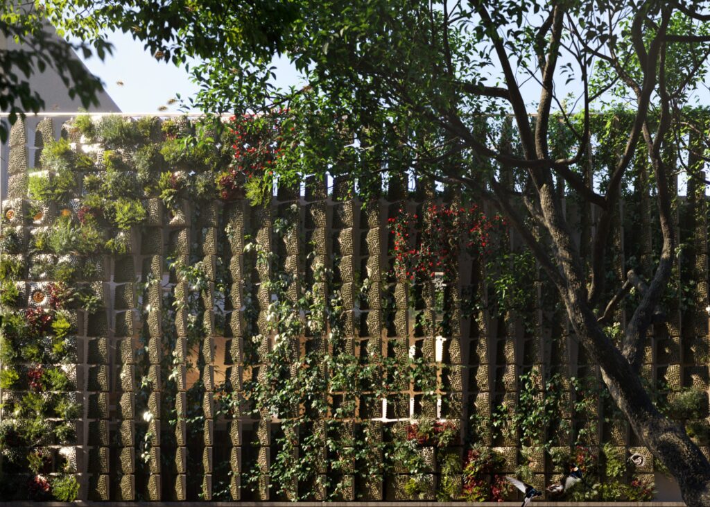
natura biomaterial facade
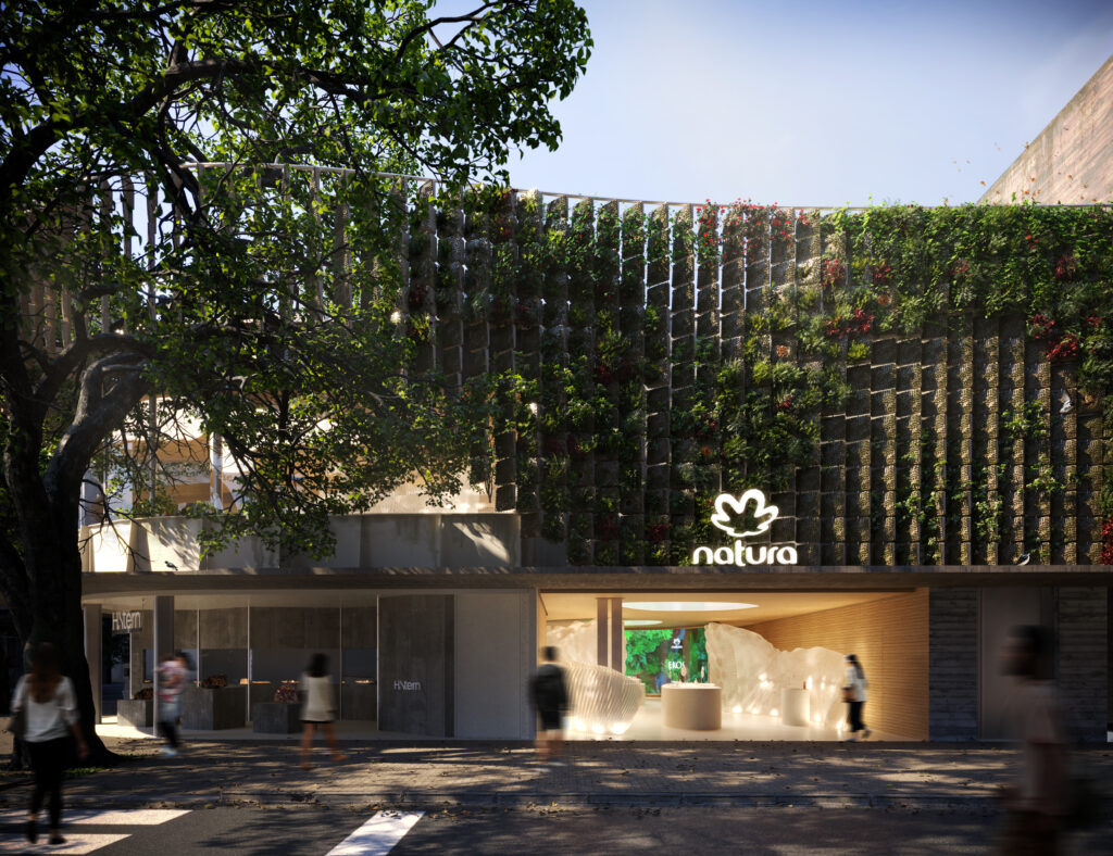
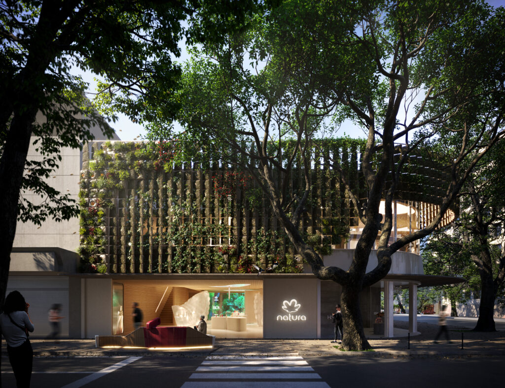
The NATURA BIOMATERIAL FACADE was carried out in collaboration with the architectural firm Estudio Guto Requena under the coordination of architect Guto Requena. My role involved developing a modular biomaterial block and designing the facade for Natura’s flagship store in Rio de Janeiro, utilizing parametric tools.
phase 1 - biomaterial blocksFor a flagship project in the beauty sector, a facade was designed to feature a porous, textured, and grooved block, drawing inspiration from the natural growth patterns of organisms like algae and corals. These grooves encourage moss growth, resulting in a continuous pattern across the surface.
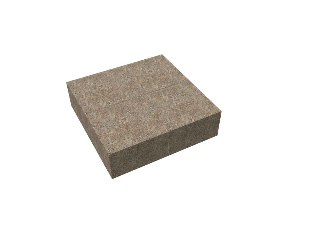
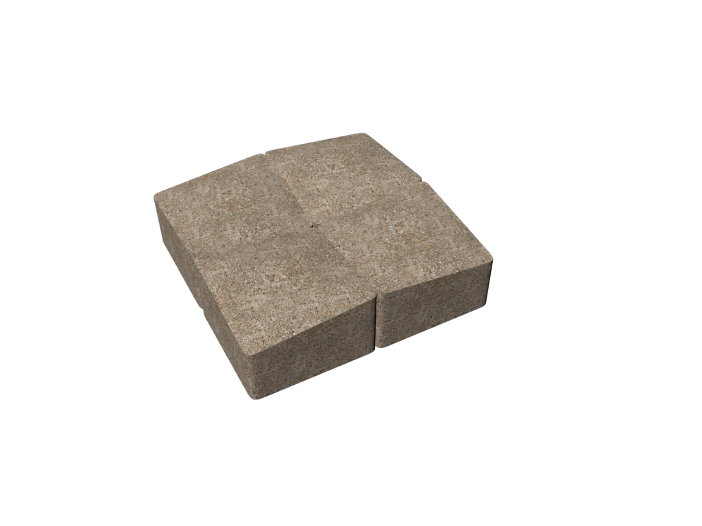
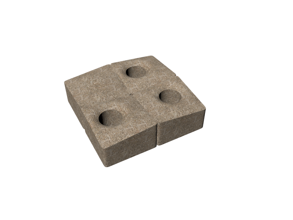

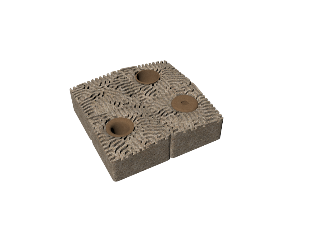

The foundation of this project lies in research on bioreceptive and bio-integrated design, particularly the work of Marcos Cruz at the Bartlett School of Architecture, University College London. His research demonstrates that rough surfaces provide an optimal anchoring system for spores, while airborne dust settles in a consistent natural growth pattern.

MATERIAL: MAGNESIUM PHOSPHATE CONCRETE (MPC)
MANUFACTURE: CNC MOULD
RESEARCHER: MARCOS CRUZ
UNIVERSITY: THE BARTLETT SCHOOL OF ARCHITECTURE, UCL, LONDON, UNITED KINGDOM
YEAR: 2016-2019

In this six-year research project, the author investigates the relationship between plants such as algae, lichens, mosses, and different types of concrete to understand bioreceptive design better. Divided into three phases, the study tests various forms of magnesium phosphate concrete (MPC) and ordinary Portland cement (OPC), along with new materials such as “TecCast poroso” and Corkcrete. TecCast is a blend that includes OPC and fibreglass, with a particularly porous version used in this study. Concrete is a mixture of OPC and cork. The study concludes that chemical residues from MPC composition and high porosity do not seem to favour the growth of algae, lichens, and mosses. These plants could grow on OPC panels due to a design that allows water accumulation and low porosity, highlighting the importance of a design that maximizes surface area for the bio-receptivity of concrete panels.
Marcos Cruz’s research also indicates that roughness creates an ideal anchoring system for settling spores and airborne dust. Marcos also suggests a mirrored or negative geometry where these species can grow, creating a continuous natural growth pattern. For example, shadowed areas, protective zones, crevices that retain dust and nutrients, and water channels are typological variables found in tree bark that provide particular conditions on the material’s surface, facilitating or restricting growth.

The blocks can be stacked and combined with the standard 39x19x19cm concrete block, as their dimensions are 39x39x22cm at the thickest part and 39x39x19cm at the thinnest.
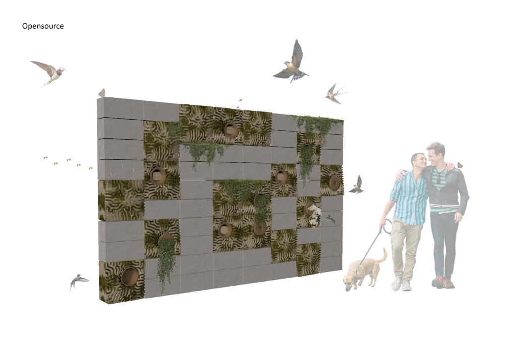
The module design can be open source, allowing its mould to be 3D printed in FAB-Labs and produced in other materials such as concrete and ceramics.
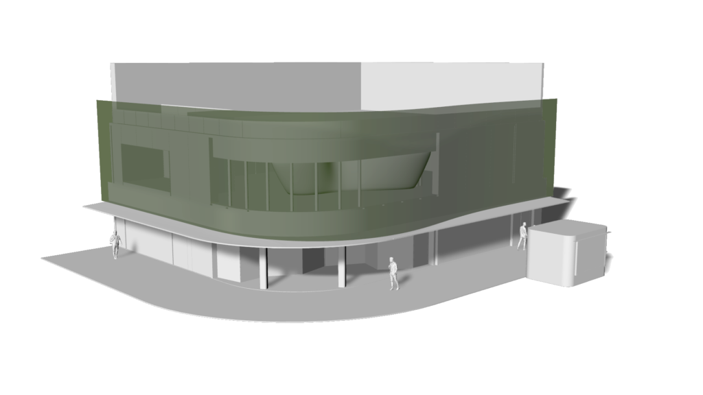
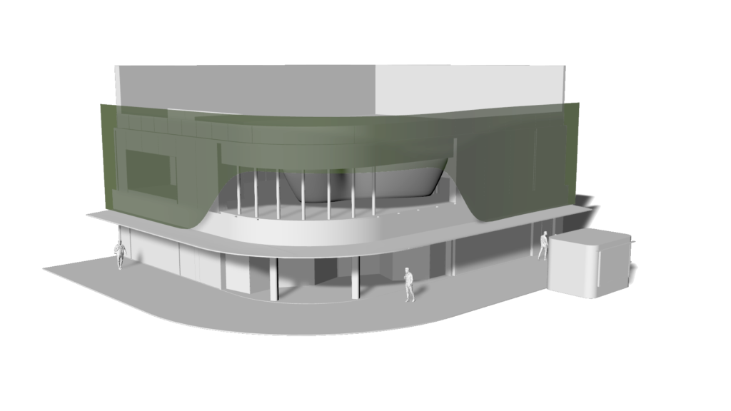
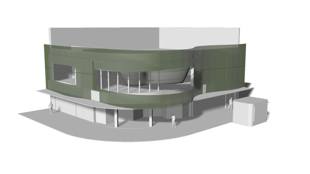
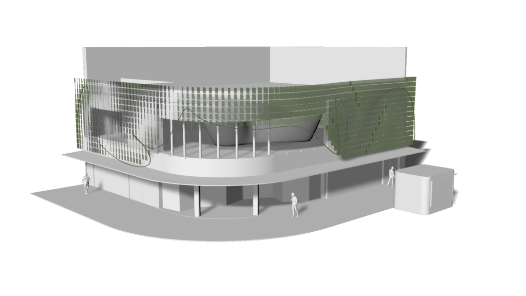
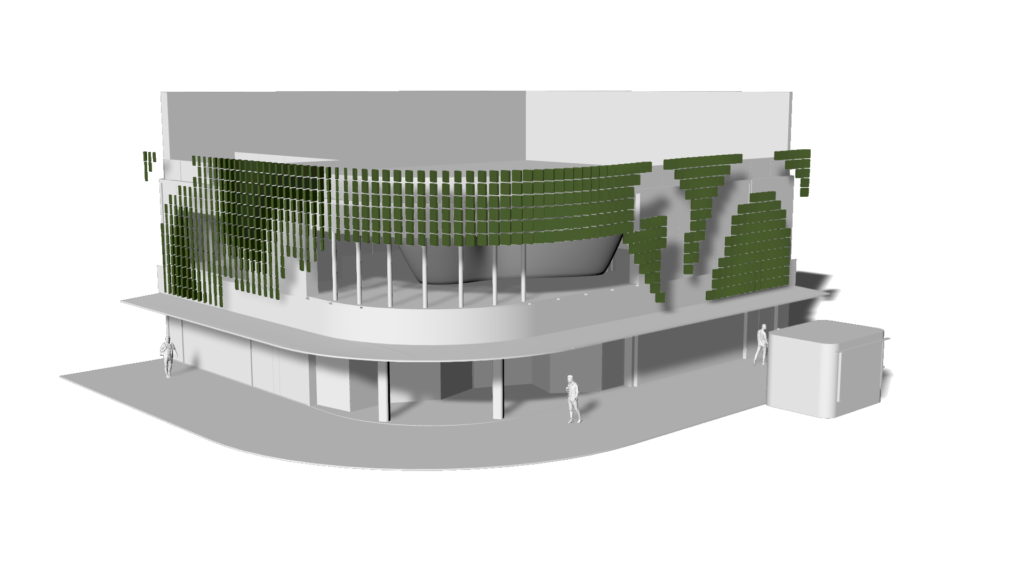
phase 2 - parametric facadeBy combining the unique block design with parametric techniques, we achieved a range of variations in size, rotation, and curvature, resulting in a facade that interacts dynamically with nature.




teamCreative Director: Guto Requena
Operations Director: Ludovica Leone
Parametric Design: Camila Calegari Marques
Architects: Camila Gonçalves, Daniel Viana, João Vargas, Matheus Fraga
Renders: Studio doisdois